
7 best product tour libraries for monorepo and design system teams (2026)
Most product tour roundups test libraries in a single-app Vite starter. That tells you nothing about what happens when you drop one into a Turborepo workspace with a shared design system, three apps consuming the same component library, and strict bundle budgets per package.
Design system teams have a specific set of problems that generic roundups ignore: style isolation (your tour tooltips cannot inject CSS that overrides your design tokens), tree-shaking across package boundaries, peer dependency conflicts in hoisted node_modules, and theming that respects your existing CSS variable system instead of fighting it.
We installed seven product tour libraries into a Turborepo + pnpm monorepo with a shared Radix-based design system and tested what actually matters: does the library tree-shake correctly when imported from a shared package? Does it conflict with your design tokens? Does it require CSS that bleeds across workspace boundaries?
Bias disclosure: We built userTourKit, so it appears first. Every claim below is verifiable against npm, GitHub, and bundlephobia. Adjust your trust accordingly.
What design system teams need from a tour library
Before the rankings, here is the rubric. We scored each library 0-10 across six categories weighted for monorepo and design system use cases:
- Style isolation (25%): Does the library inject global CSS? Can you theme it with your design tokens? Or does it ship opinionated styles that conflict with your
--color-primaryvariable? - Tree-shaking (20%): Does unused code get eliminated when only one app in your monorepo imports the tour? Does
sideEffects: falsework correctly? - Peer dependency hygiene (15%): Does it pin React to a specific version? Does it add transitive dependencies that conflict with your workspace's hoisted packages?
- TypeScript across workspaces (15%): Do types resolve correctly when the library is re-exported from a shared package? Or do you get
anyleaks at workspace boundaries? - Headless architecture (15%): Can you render tour UI with your own design system components? Or are you locked into the library's tooltip design?
- ESM/CJS dual output (10%): Does the library ship proper module formats for both bundled apps and SSR environments in your monorepo?
We weighted style isolation highest because it is the single most common reason design system teams reject a tour library after evaluation. A library that injects .shepherd-element { z-index: 9999 } into your global scope is a non-starter when your design system has its own z-index scale.
Quick comparison
| Library | Headless | Tree-shake | Style isolation | Bundle (gzip) | License | DS score |
|---|---|---|---|---|---|---|
| userTourKit | Full | Per-package | Zero injected CSS | Under 8KB core | MIT | 9.4 |
| Driver.js | No | Good | CSS file required | ~5KB | MIT | 7.2 |
| OnboardJS | State only | Good | No UI shipped | ~10KB | MIT | 7.0 |
| Shepherd.js | No | Partial | Global CSS injected | ~25KB | MIT | 5.1 |
| Onborda | Partial | Good | Tailwind-native | ~8KB + Framer | MIT | 6.8 |
| React Joyride | No | Poor | Inline styles | ~30KB | MIT | 3.8 |
| Reactour | Partial | Acceptable | Styled-components | ~12KB + SC | MIT | 4.5 |
Data verified April 2026. Sources: npm, GitHub, bundlephobia, package source inspection.
1. userTourKit: built for monorepo and design system teams
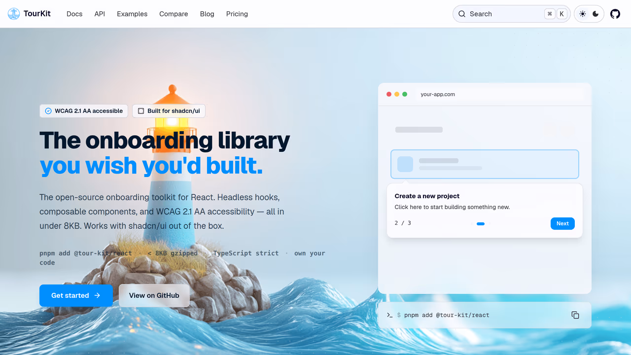
userTourKit is a headless product tour library structured as a monorepo itself. The core package (@tourkit/core) ships logic only, at under 8KB gzipped with zero runtime dependencies. The React package (@tourkit/react) adds hooks and renderless components. Neither package ships any CSS.
This matters for design system teams because you render tour UI with your own components. Your tooltip is your <Tooltip> from your design system, styled with your tokens, respecting your z-index scale. There is no style override to fight.
Why monorepo teams pick this:
The library mirrors the architecture you already have. Each package (core, react, hints, analytics, checklists) has its own entry point with sideEffects: false. When App A imports @tourkit/react but App B only imports @tourkit/core, App B does not bundle React components. Tree-shaking works at the package boundary, not just the module level.
// packages/shared-onboarding/src/welcome-tour.tsx
// This lives in your shared package and uses YOUR design system components
import { TourProvider, useTour } from '@tourkit/react';
import { Tooltip, Button } from '@acme/design-system';

const steps = [
  {
    id: 'nav',
    target: '#sidebar',
    title: 'Navigation',
    content: 'Browse your projects here.',
  },
];

function TourTooltip() {
  const { currentStep, next, prev, isActive } = useTour();
  if (!isActive || !currentStep) return null;

  // Your design system tooltip — your tokens, your z-index, your animations
  return (
    <Tooltip>
      <Tooltip.Title>{currentStep.title}</Tooltip.Title>
      <Tooltip.Content>{currentStep.content}</Tooltip.Content>
      <Tooltip.Footer>
        <Button variant="ghost" onClick={prev}>Back</Button>
        <Button onClick={next}>Next</Button>
      </Tooltip.Footer>
    </Tooltip>
  );
}

export function WelcomeTour({ children }: { children: React.ReactNode }) {
  return (
    <TourProvider tourId="welcome" steps={steps}>
      <TourTooltip />
      {children}
    </TourProvider>
  );
}
Peer dependency story: Only react and react-dom as peers. No Floating UI, no Popper, no animation library. If your design system already uses Radix (which bundles Floating UI internally), there is zero additive dependency cost.
TypeScript across workspaces: Strict mode from line one. When you re-export tour hooks from a shared workspace package, types flow through without any leaks. Generic step metadata means useStep<MyStepData>() preserves your custom fields at the workspace boundary.
Strengths:
- Zero CSS output means zero style conflicts with any design system
- Per-package tree-shaking with proper
sideEffects: falseon every sub-package - 10 optional packages (analytics, checklists, hints, scheduling, surveys) that tree-shake independently
- Works with shadcn/ui, Radix, Base UI, or any component library via the typed
asChildpattern - ESM + CJS dual output via tsup, SSR-safe
Limitations:
- Requires React. No Vue, Svelte, or vanilla JS support.
- You must build your own tooltip UI. No pre-built components to drop in.
- Smaller community than React Joyride or Shepherd.js.
Pricing: Free (MIT core). Pro features $99 one-time.
Best for: Teams with an existing design system who want the tour library to disappear into their component architecture, not fight it.
2. Driver.js: best vanilla option for multi-framework monorepos
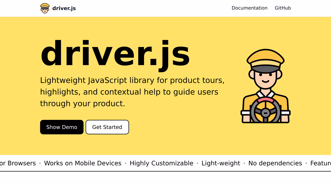
Driver.js is framework-agnostic with zero dependencies, shipping at roughly 5KB gzipped. For monorepos that span React, Vue, and vanilla TypeScript apps, the framework-agnostic approach avoids per-framework wrapper packages.
The design system problem: Driver.js requires importing driver.js/dist/driver.css. That CSS file contains opinionated styles for the popover, overlay, and highlight. In a monorepo with a shared design system, you need to either override these styles globally (which means your design tokens fight Driver's defaults) or scope the import to specific apps.
The workaround is to skip the default CSS entirely and write your own using Driver's DOM structure. This works but means you are maintaining a parallel style layer outside your design system's token system.
// packages/shared-tours/src/setup-tour.ts
import { driver, DriveStep } from 'driver.js';
// Skip default CSS — use your own design system styles instead
// import 'driver.js/dist/driver.css';

const steps: DriveStep[] = [
  {
    element: '#sidebar',
    popover: {
      title: 'Navigation',
      description: 'Browse your projects.',
      side: 'right',
    },
  },
];

export function createSetupTour() {
  return driver({
    steps,
    popoverClass: 'acme-ds-popover', // Your design system class
    overlayColor: 'var(--color-overlay)', // Your CSS variable
  });
}
Tree-shaking: Single entry point, no sub-packages. The entire library is roughly 5KB, so tree-shaking matters less here. But it does mean every app that imports it gets the full library regardless of which features they use.
Peer dependencies: None. Zero transitive dependencies. This is the cleanest dependency story on this list for monorepos with strict hoisting policies.
Strengths:
- Zero dependencies. Cleanest
node_modulesfootprint. - Framework-agnostic. Use it in React, Vue, and vanilla apps within the same monorepo.
- Small enough that tree-shaking is a non-issue.
- TypeScript types are first-party and complete.
Limitations:
- Requires CSS import that conflicts with design systems. Customization means maintaining styles outside your token system.
- No headless mode. You cannot swap in your own tooltip component.
- No React hooks or components. Manual
useEffectwiring in React apps. - No generic step metadata for typed custom fields.
Pricing: Free (MIT).
Best for: Multi-framework monorepos where you need tours in both React and non-React apps and can accept the CSS override cost.
3. OnboardJS: headless state machine, you build the UI
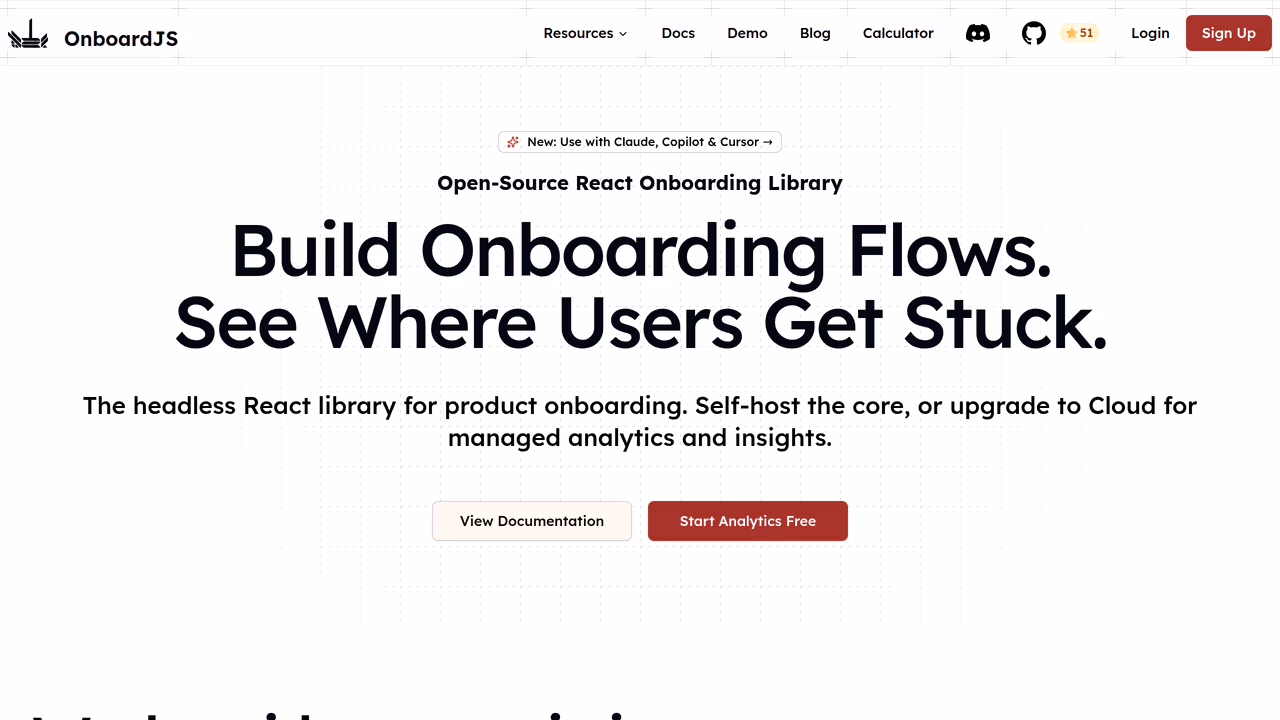
OnboardJS takes a different approach: it is a state machine for onboarding flows, not a UI library. You get step management, progress tracking, and transition logic. You build all the UI yourself.
For design system teams, this is conceptually appealing. There is literally no UI to conflict with. The library manages state; your design system renders everything.
The monorepo angle: OnboardJS ships React bindings separately from the core state machine. In theory, this means a non-React app in your monorepo could use the core without pulling in React. In practice, the React bindings are where most of the value is, and the separation adds one more package to manage.
The catch: Because OnboardJS provides no positioning logic, no overlay system, and no DOM measurement, you build all of that yourself. For a team with a mature design system that already has a <Popover> with positioning, this is fine. For a team that does not, you are rebuilding half of what a tour library provides.
Strengths:
- Zero UI means zero style conflicts. Period.
- State machine approach composes well with existing state management in your app.
- React bindings are separate from core (useful for multi-framework monorepos).
Limitations:
- You must build positioning, overlays, highlights, and scroll behavior yourself.
- Smaller community. Fewer battle-tested production deployments.
- No built-in accessibility (focus trapping, ARIA announcements) — you implement it.
- Documentation is thinner than established alternatives.
Pricing: Free (MIT).
Best for: Teams with a mature design system that already has popover/tooltip primitives and just needs the state machine for step orchestration.
4. Onborda: Tailwind-native, good for Next.js design systems
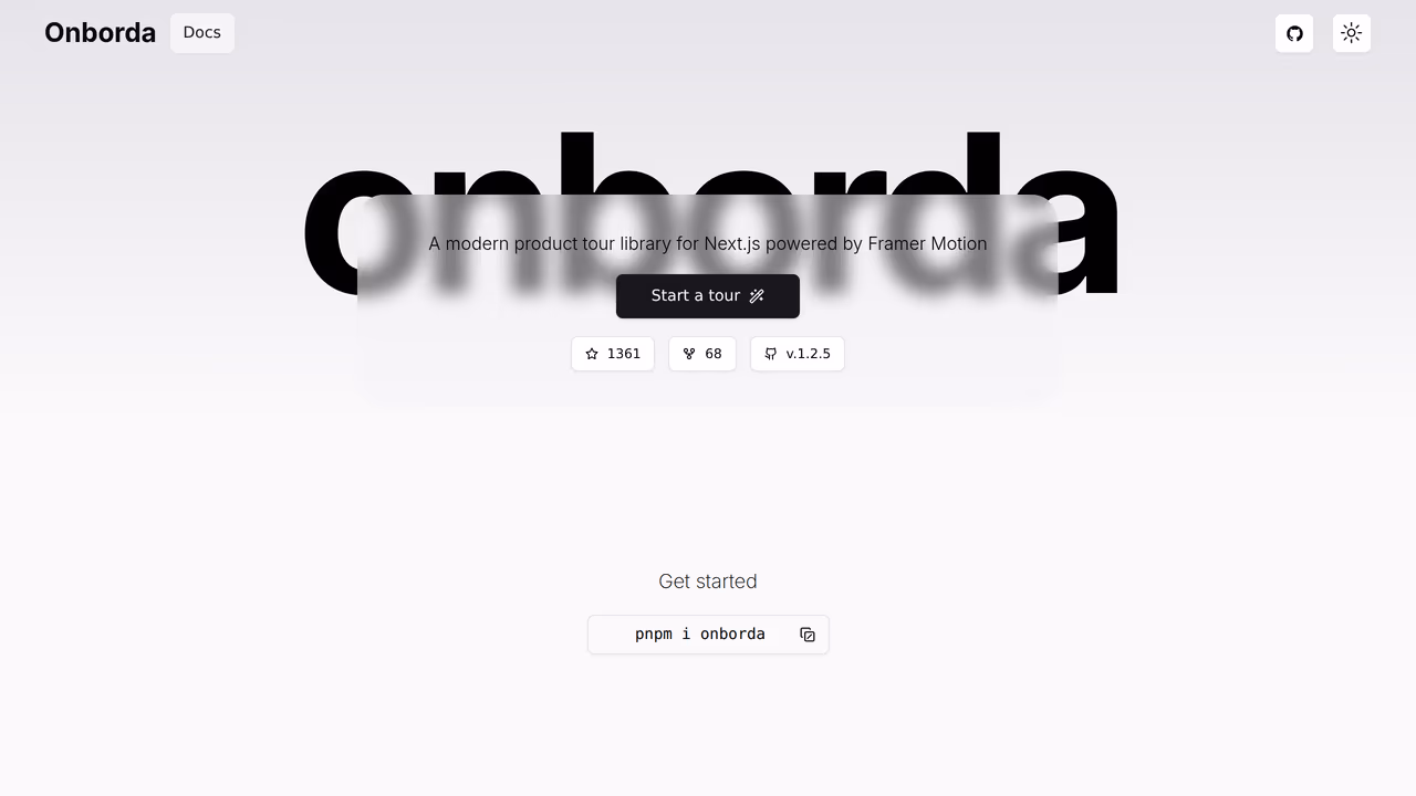
Onborda is built for Next.js App Router with Tailwind CSS styling. If your design system is Tailwind-based, this is one of the few tour libraries where theming does not require fighting the library's CSS.
Design system fit: Onborda uses Tailwind classes for all styling. Your design system's Tailwind config (custom colors, spacing, fonts) applies directly to tour components. No separate CSS file, no inline styles to override. The CardComponent prop lets you pass your own React component for the tooltip, giving partial headless capability.
// apps/dashboard/src/components/onboarding.tsx
import { Onborda, OnbordaProvider } from 'onborda';
import { TourCard } from '@acme/design-system'; // Your component

const steps = [
  {
    icon: <>👋</>,
    selector: '#sidebar',
    content: <TourCard title="Navigation" body="Browse projects here." />,
    side: 'right',
  },
];

export function Onboarding({ children }: { children: React.ReactNode }) {
  return (
    <OnbordaProvider>
      <Onborda steps={steps} cardComponent={TourCard}>
        {children}
      </Onborda>
    </OnbordaProvider>
  );
}
The monorepo problem: Onborda expects Next.js App Router patterns ('use client' boundaries, specific router hooks). If your monorepo has a Vite app alongside Next.js, Onborda only works in the Next.js apps. Framer Motion as a peer dependency adds roughly 30KB and can cause version conflicts if different apps in your monorepo pin different Framer versions.
Strengths:
- Tailwind-native styling. Your design tokens flow through without overrides.
- Custom card component prop gives partial headless control.
- React 19 compatible. No type conflicts with Next.js 15.
- Simple API surface with fewer than five exported types.
Limitations:
- Next.js App Router only. Does not work in Vite, Remix, or non-Next apps.
- Framer Motion peer dependency adds bundle weight and potential version conflicts in monorepos.
- Not fully headless. Overlay and highlight rendering is still controlled by Onborda.
- No typed accessibility props in step config.
Pricing: Free (MIT).
Best for: Next.js-only monorepos with Tailwind-based design systems where every app uses App Router.
5. Shepherd.js: flexible but heavy for design system use
Shepherd.js has roughly 12K GitHub stars and 130K weekly npm downloads. It is mature, actively maintained, and has the most flexible step API of any library on this list. But for design system teams, that flexibility comes with baggage.
The style problem: Shepherd injects global CSS with selectors like .shepherd-element, .shepherd-modal-overlay-container, and .shepherd-button. These selectors use !important in several places. If your design system has a <Button> component with specific padding, font-size, and color tokens, Shepherd's .shepherd-button styles will fight yours unless you write specificity overrides.
One independent evaluation noted: "For everything beyond the basics, you will have to leave JSX behind and work either with HTML strings or plain HTML elements" (sandroroth.com). That means your design system's React components cannot be used directly inside Shepherd steps without workarounds.
Tree-shaking: Shepherd bundles Floating UI internally. At roughly 25KB gzipped, it is the heaviest library on this list. If your design system already uses Radix (which also bundles Floating UI), you are shipping two copies of the same positioning library.
The React wrapper problem: The react-shepherd wrapper has not kept pace with the core library. Version 12 removed the Shepherd namespace (GitHub #2869), breaking TypeScript imports for developers using Shepherd.Tour as a type. The fix requires moduleResolution: 'Bundler' which may conflict with your monorepo's shared TypeScript config.
Strengths:
- Most configurable step API. Fine-grained control over every aspect of tour behavior.
- Built-in keyboard navigation and focus trapping. Best accessibility of the legacy libraries.
- Active maintenance with regular 2026 releases.
- Floating UI positioning is robust and handles edge cases well.
Limitations:
- Global CSS with
!importantconflicts with design system tokens. - ~25KB gzipped. Heaviest option. Duplicate Floating UI if you already use Radix.
- React wrapper is fragile. TypeScript namespace removal broke imports.
- HTML string-based content means your React design system components require workarounds.
Pricing: Free (MIT).
Best for: Teams that need maximum configurability and do not have strict style isolation requirements.
6. Reactour: styled-components lock-in
Reactour has roughly 3.3K GitHub stars and uses styled-components for its internal styling. It offers a ContentComponent prop that lets you pass a custom React component for the tooltip content, giving partial headless capability.
The design system problem: styled-components as a runtime dependency is a significant constraint for design system teams. If your design system uses Tailwind, CSS Modules, or vanilla-extract, you are now shipping two styling systems. The styled-components runtime adds to bundle size and introduces a separate theming context that does not share your design tokens unless you explicitly wire it up.
If your design system already uses styled-components or Emotion, the integration is smoother. Reactour's ThemeProvider can share the same theme object. But the trend in 2026 is away from CSS-in-JS runtimes (styled-components usage has declined steadily), and adopting a tour library should not lock you into one.
Tree-shaking: Acceptable but not great. The library ships as a single bundle. styled-components as a peer dependency adds roughly 12KB on its own. Total cost for a monorepo app that does not already use styled-components: approximately 24KB gzipped just for the tour.
Strengths:
ContentComponentprop gives partial headless control over tooltip content.- Simple API. Quick to integrate for a prototype.
- Stable positioning behavior.
Limitations:
- styled-components runtime dependency conflicts with Tailwind/CSS Modules design systems.
- Not fully headless. Overlay, mask, and positioning are still Reactour-controlled.
- Single-bundle output. No per-feature tree-shaking.
- Stale maintenance. Fewer updates in 2026 compared to active alternatives.
Pricing: Free (MIT).
Best for: Teams already using styled-components who want a simple tour without building from scratch.
7. React Joyride: popular but hostile to design systems
React Joyride has the highest weekly npm downloads of any React tour library at over 340K. It is the library most teams evaluate first. For design system teams, it is often the first one they reject.
The style problem: React Joyride uses inline styles heavily, injected via react-floater. Overriding inline styles requires either the styles prop (a deeply nested object that maps to specific DOM nodes) or !important in your CSS. Neither approach integrates with a design token system. You cannot point Joyride at your --spacing-md variable and have it work. You manually map every token to every style override.
The bundle problem: At roughly 30KB gzipped with its dependency on react-floater and popper.js, React Joyride is the heaviest option. In a monorepo where bundle budgets are enforced per-app, 30KB for a tour library that only runs during onboarding is hard to justify. The library does not tree-shake well because internal modules have side effects.
TypeScript: Types exist but the Step type has known any leaks (GitHub #949). When re-exported from a shared workspace package, these any types propagate across your monorepo, undermining the strict TypeScript config your design system team likely enforces.
Strengths:
- Largest community. Most Stack Overflow answers and blog tutorials.
- Feature-complete out of the box. Overlays, scrolling, beacons all built in.
tooltipComponentprop gives some customization.
Limitations:
- Inline styles conflict with design tokens. Overriding requires manual mapping.
- ~30KB gzipped. Heaviest option with poor tree-shaking.
Steptype hasanyleaks that propagate across workspace boundaries.- 9 months without a release as of April 2026. React 19 compatibility is untested.
Pricing: Free (MIT).
Best for: Quick prototypes where design system consistency is not a priority.
The real question: headless or styled?
For design system teams, the choice reduces to a single architectural decision: do you want the tour library to render UI, or do you want it to manage state while your design system renders everything?
Choose headless (userTourKit, OnboardJS) if:
- Your design system has tooltip, popover, and overlay primitives already built
- Style isolation is non-negotiable
- You enforce bundle budgets per workspace package
- Multiple apps consume the same shared tour configuration
Choose styled (Driver.js, Shepherd.js, Onborda) if:
- You do not have existing popover/tooltip components to build on
- Getting a tour working in hours matters more than design system alignment
- Your monorepo is single-framework (easier to manage one library's CSS)
Avoid for design systems (React Joyride, Reactour) if:
- You enforce strict design token usage
- Bundle budgets are tight
- TypeScript strictness is enforced across workspaces
The libraries that fight your design system will keep fighting it with every update. The ones that stay out of the way let your design system do what it was built to do.


Own your onboarding. Ship it today.
No vendor lock-in. No monthly invoice. Just code you control and users who convert.
Related articles

10 Best Product Tour Tools for React Developers (2026)
Discover the best product tour tools for React in 2026. We installed and tested 10 options, comparing bundle size, TypeScript support, React 19 compatibility, and pricing.
Read article
Best Free Product Tour Libraries in 2026 (Open Source Only)
We installed 9 open-source tour libraries into the same React 19 project. Here's what actually works, what's abandoned, and which licenses have traps.
Read article
7 Best Headless UI Libraries for Onboarding in 2026
We tested 7 headless libraries for building product tours and onboarding flows in React. Comparing bundle size, accessibility, and composition patterns.
Read article
8 TypeScript Product Tour Libraries Ranked by Developer Experience (2026)
We tested 8 product tour libraries for TypeScript quality. See which have real types, which ship broken generics, and which force you into any.
Read article