
7 best headless UI libraries for onboarding in 2026
Most product tour libraries ship with tooltips you can't restyle, overlays that fight your CSS, and configuration objects that look like they were designed by committee. The headless pattern fixes this. You get the logic (step sequencing, element targeting, scroll management, keyboard navigation) and bring your own components. Your Tailwind classes, your shadcn/ui primitives, your design tokens.
"Headless onboarding library" barely exists as a category. Only two libraries are purpose-built for it. The rest are headless UI primitive libraries whose popovers and dialogs become onboarding building blocks when you wire them together with tour logic.
npm install @tourkit/core @tourkit/reactHow we evaluated these libraries
We installed each library into a Vite 6 + React 19 + TypeScript 5.7 project and scored them on four criteria: composition patterns (does it use asChild, render props, or hooks?), accessibility (WCAG 2.1 AA, focus management, keyboard navigation), bundle size (via bundlephobia), and React 19 compatibility.
Two libraries are purpose-built onboarding tools. The other five are headless UI primitive libraries whose popovers and dialogs become tour building blocks. We included both categories because a headless onboarding setup typically means pairing a tour engine with a UI primitive library.
Bias disclosure: We built userTourKit, so it's listed first. Take our #1 ranking with appropriate skepticism. Every claim is verifiable against npm, GitHub, and bundlephobia.
Quick comparison table
| Library | Type | DOM tours | React 19 | Components | License | Best for |
|---|---|---|---|---|---|---|
| userTourKit | Headless tour library | ✅ | ✅ | 10 packages | MIT (core) | Full onboarding with your design system |
| OnboardJS | Flow orchestrator | ❌ | ✅ | State machine | Open source | Non-DOM onboarding flows |
| Radix Primitives | UI primitives | ❌ | ✅ | 28+ | MIT | Tour tooltip/popover rendering |
| React Aria | Hooks library | ❌ | ✅ | 43+ | Apache 2.0 | Accessibility-first tour UI |
| Base UI | UI primitives | ❌ | ✅ | 35+ | MIT | MUI teams going headless |
| Ark UI | UI primitives | ❌ | ✅ | 34+ | MIT | Multi-framework tour rendering |
| Headless UI | UI primitives | ❌ | ✅ | ~10 | MIT | Tailwind-first tour components |
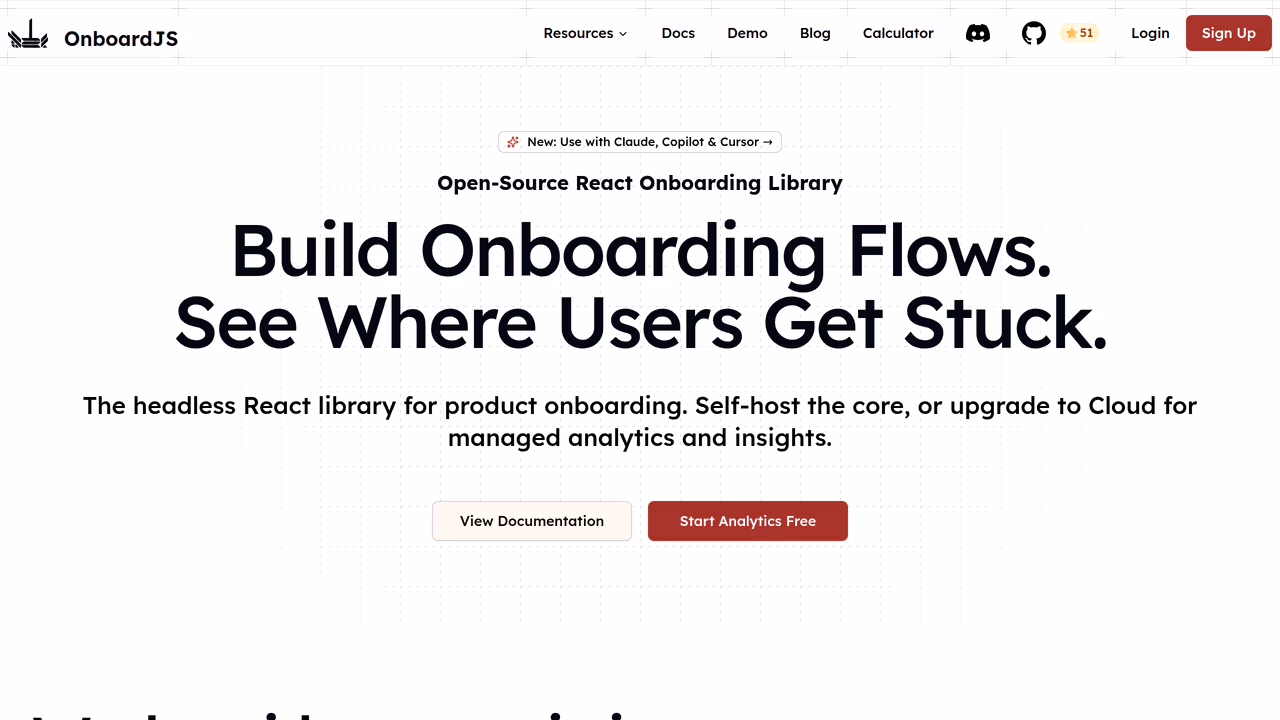
1. userTourKit — best headless onboarding library for React
userTourKit is a composable headless onboarding library for React that ships tour logic as hooks and renders nothing by default. Core bundle sits under 8KB gzipped. Ten installable packages cover tours, hints, checklists, announcements, analytics, scheduling, adoption tracking, and media without forcing you to install what you don't need. Built for React 18 and 19, it uses the asChild composition pattern from Radix to merge tour behavior into your existing components.
Strengths
- Headless by default.
useTour(),useStep(), anduseTourHighlight()give you state and callbacks. You render the tooltip, the overlay, the progress indicator. - The
asChildprop (via Unified Slot) lets you attach tour behavior to your existing shadcn/ui or Radix components without wrapper divs. - 10 composable packages: install
@tourkit/coreand@tourkit/reactfor tours, add@tourkit/hintsfor beacons,@tourkit/checklistsfor task lists,@tourkit/analyticsfor event tracking. Each tree-shakes independently. - WCAG 2.1 AA compliant with built-in focus management, keyboard navigation, and ARIA live regions.
Limitations
- No visual builder. You write JSX for every step. Product managers who want a drag-and-drop editor won't find one here.
- React 18+ only. No support for older React versions, no Vue or Angular wrapper.
- Younger project with a smaller community than React Joyride or Shepherd.js. Fewer Stack Overflow answers.
Pricing
Core packages are MIT and free. Extended packages (adoption, announcements, checklists, media, scheduling) require a Pro license at $99 one-time.
Best for
React teams with a custom design system (shadcn/ui, Tailwind, Radix) who want full control over onboarding UI and don't want to fight a library's opinions about how tooltips should look.
// src/components/ProductTour.tsx
import { TourProvider, TourStep, TourHighlight } from "@tourkit/react";

const steps = [
  { id: "sidebar", target: "#sidebar-nav", title: "Navigation" },
  { id: "search", target: "#search-bar", title: "Search" },
  { id: "profile", target: "#user-menu", title: "Your profile" },
];

export function ProductTour() {
  return (
    <TourProvider steps={steps}>
      <TourStep>
        {({ step, next, prev, isFirst, isLast }) => (
          <div className="rounded-lg border bg-popover p-4 shadow-md">
            <p className="font-medium">{step.title}</p>
            <div className="mt-3 flex gap-2">
              {!isFirst && <button onClick={prev}>Back</button>}
              <button onClick={next}>{isLast ? "Done" : "Next"}</button>
            </div>
          </div>
        )}
      </TourStep>
      <TourHighlight className="ring-2 ring-primary" />
    </TourProvider>
  );
}
2. OnboardJS — best headless flow orchestrator
OnboardJS is a headless onboarding framework that handles flow logic, state management, persistence, and analytics without rendering a single DOM element. As their docs describe it: "OnboardJS handles the 'brain' (the flow logic, state management, data persistence, and navigation) completely separate from the 'body' (your user interface)" (OnboardJS docs). It uses a state machine architecture with React bindings and ships plugins for PostHog, Mixpanel, and Supabase.
Strengths
- Truly headless with zero DOM assumptions. Your onboarding can be a modal wizard, a sidebar checklist, or a full-page flow. OnboardJS doesn't care what it looks like.
- Built-in analytics plugins for PostHog, Mixpanel, and Supabase reduce integration boilerplate.
- State machine architecture makes complex branching flows predictable. Conditional steps and skip logic work out of the box.
Limitations
- No DOM tour support. OnboardJS cannot highlight page elements or position tooltips near a sidebar. If your onboarding needs a guided walkthrough of your actual UI, you need a different tool.
- Smaller community and less documentation than established tour libraries.
Pricing
Open source with a free tier. SaaS hosted version starts at $59/month.
Best for
Teams building checklist-style or wizard-style onboarding that doesn't need element highlighting. Think "complete your profile" flows, not "click this button" walkthroughs.
3. Radix Primitives — best headless UI primitives for custom tour steps
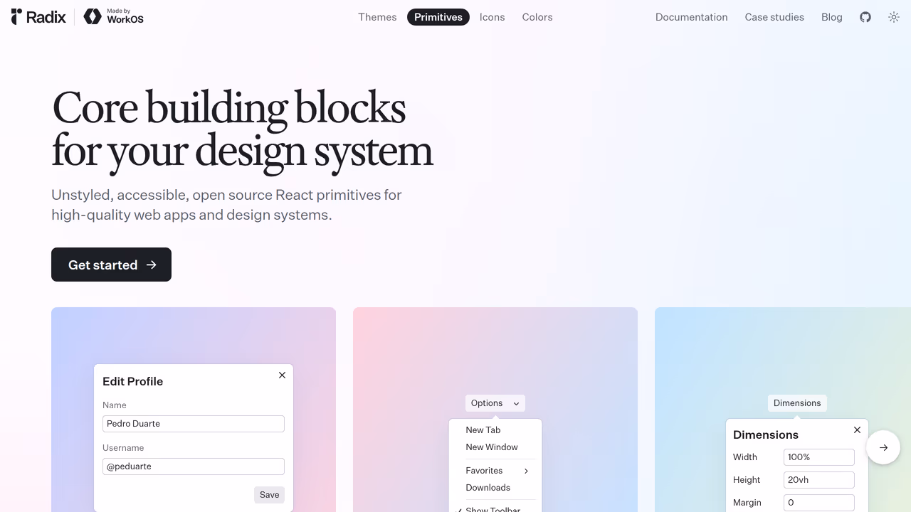
Radix Primitives provides 28+ unstyled, accessible React components. Popover, Tooltip, Dialog, and Progress all become building blocks for product tour step UI. As of April 2026, Vercel, Supabase, and Linear use Radix for their design systems, making it the most battle-tested headless primitive library in React. Headless component adoption grew 70% in 2025, with Radix as a primary driver (Bitsrc).
Strengths
- The
asChildcomposition pattern lets you merge primitive behavior onto any element without wrapper divs. Every Radix component supports it. - Excellent accessibility defaults: focus trapping in dialogs, keyboard dismiss on popovers, proper ARIA attributes baked in.
- shadcn/ui is built on Radix, so if your team already uses shadcn, you're already familiar with the API.
- Each primitive is independently importable and tree-shakes cleanly.
Limitations
- No tour logic. Radix gives you the popover and the tooltip but not step sequencing, element highlighting, or progress tracking. Pair it with a tour engine or build your own.
- React only. No Vue, Solid, or Angular support.
Pricing
Free and MIT licensed.
Best for
Teams already on Radix or shadcn/ui who want to compose tour step UI from the same primitives they use everywhere else. Pair with userTourKit's hooks for a fully headless onboarding stack.
4. React Aria (Adobe) — best headless accessibility layer for tour UI
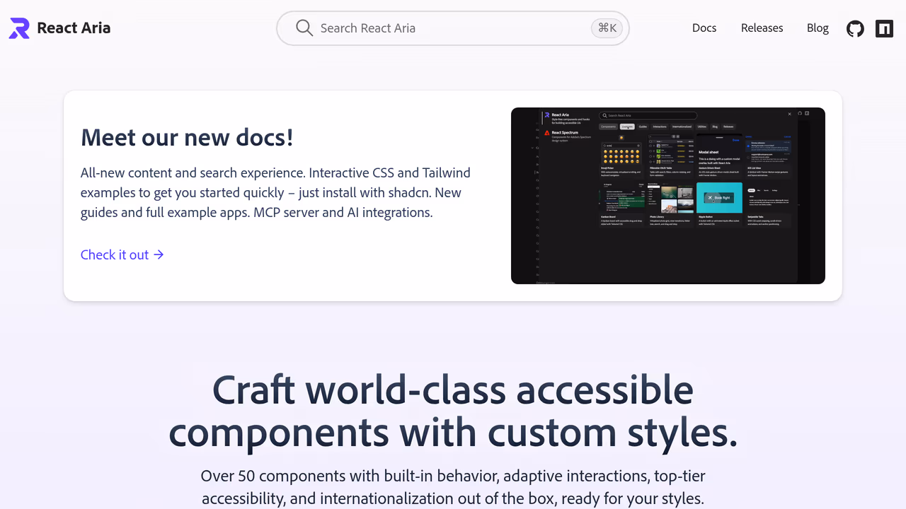
React Aria is Adobe's hooks-based headless UI library with 43+ component patterns, each built to meet WAI-ARIA design pattern specifications. For tour builders, usePopover, useDialog, useTooltip, and useFocusScope provide the accessibility layer that most tour libraries get wrong. One analysis of Intro.js found broken ARIA roles, missing focus traps, and buttons coded as anchor elements. React Aria prevents all of these by design (Dev.to).
Strengths
- Hooks-first architecture gives you maximum control.
usePopover()returns ARIA props and positioning logic that you attach to whatever element you want. - The most thorough accessibility implementation of any headless library. Focus management, screen reader announcements, and keyboard interactions work without custom code.
- Internationalization built in across all hooks (40+ locales).
Limitations
- Steep learning curve. The hooks API is explicit about everything (state, refs, event handlers), which means more code per component than Radix's compound-component approach.
- No tour-specific logic. Like Radix, you get UI primitives, not step sequencing or element targeting.
Pricing
Free. Apache 2.0 license.
Best for
Teams where accessibility compliance is a hard requirement (government, healthcare, finance) and who need audit-proof ARIA implementation in their tour components.
5. Base UI — best headless primitives for MUI teams going unstyled
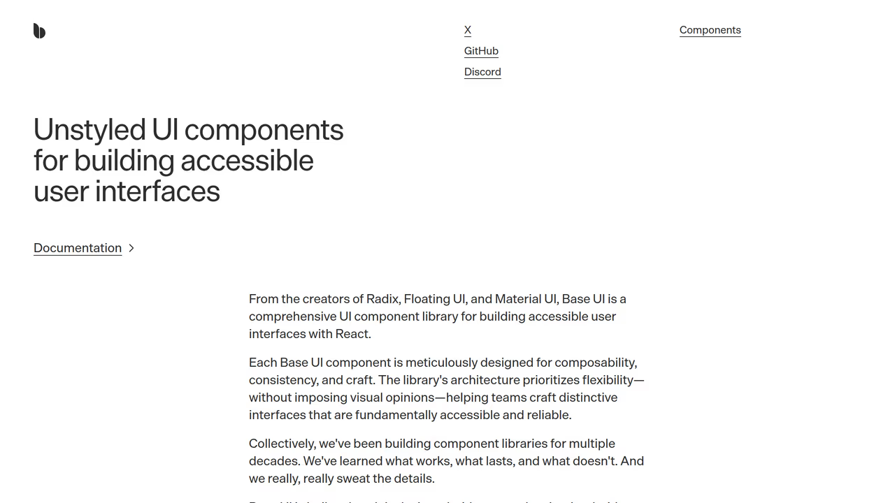
Base UI reached v1 in February 2026 with 35+ accessible, unstyled components, separating from Material UI as its own library (InfoQ). For onboarding UI, Popup, Dialog, Tooltip, and Progress are the relevant primitives. Base UI uses a wrapper-component pattern (similar to Radix) and ships fully tree-shakable exports.
Strengths
- Clean separation from Material UI means you get headless primitives without Material Design baggage. Teams migrating from MUI keep familiar APIs.
- 35+ components at v1 launch, comparable to Radix in scope. Each is tree-shakable and independently installable.
- Active development backed by MUI's engineering resources.
Limitations
- v1 shipped February 2026, so community patterns and third-party tutorials are still catching up.
- React only. Smaller ecosystem than Radix with fewer component libraries built on top of it.
Pricing
Free. MIT licensed.
Best for
Teams currently on Material UI who want to move toward headless components without changing their mental model. Useful for building tour step UI that matches your existing MUI-based design system.
6. Ark UI — best headless primitives for multi-framework teams
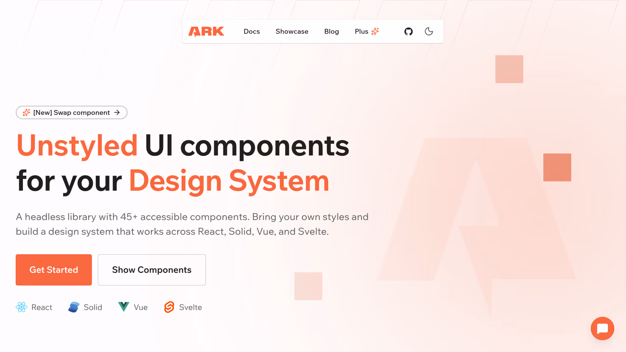
Ark UI provides 34+ headless components for React, Vue, and Solid from a single codebase, built on state machines that share logic across frameworks. For teams running onboarding in a React dashboard and a Vue marketing site, Ark UI is the only headless library where popover, tooltip, and dialog behavior is identical across frameworks.
Strengths
- Write tour component markup once and port the pattern to React, Vue, or Solid. API surface stays nearly identical across all three.
- Supports
asChild(like Radix) for merging behavior onto existing elements. Built on Zag.js state machines for predictable behavior. - Data attributes for styling (
data-state="open") work naturally with Tailwind.
Limitations
- Smaller community than Radix or React Aria. Fewer examples online.
- No tour logic, same as other primitive libraries on this list.
Pricing
Free. MIT licensed.
Best for
Teams maintaining applications across multiple frameworks who want consistent headless primitives for their onboarding UI in each one.
7. Headless UI (Tailwind Labs) — best minimal headless component set
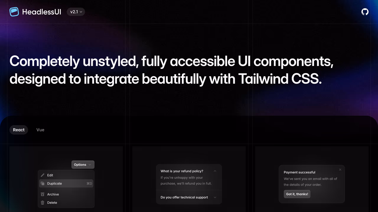
Headless UI ships about 10 unstyled components designed specifically to pair with Tailwind CSS. Dialog, Popover, Menu, Listbox, Combobox, Disclosure, Tabs, and a few more. Smallest library on this list. For onboarding, Dialog and Popover are the relevant primitives.
Strengths
- Tiny API surface means less to learn. If you only need a popover and a dialog for your tour steps, 10 components is plenty.
- First-class Tailwind integration. Render props expose component state for Tailwind class application:
className={({ open }) => open ? 'opacity-100' : 'opacity-0'}. - Maintained by Tailwind Labs with React and Vue support.
Limitations
- Limited scope. No Tooltip component (you'd need Floating UI separately), no Progress bar. Other headless libraries cover more onboarding-relevant primitives.
- Render prop API feels dated compared to Radix's compound components or React Aria's hooks.
- No element highlighting or step sequencing. Bigger gap to bridge for a full tour than Radix or React Aria.
Pricing
Free. MIT licensed.
Best for
Tailwind-first teams who want the absolute minimum headless dependency for tour step rendering and are comfortable building the rest themselves.
How to choose the right headless onboarding library
The decision comes down to what you mean by "onboarding."
If you need guided product tours with element highlighting and step navigation, choose a dedicated headless tour library. As of April 2026, userTourKit is the one library we found that combines headless rendering with DOM-aware tour features (targeting, highlighting, scroll management) while supporting React 19. The alternative is building it yourself with Floating UI and a state manager, which is what developer Sandro Roth ended up doing after evaluating every existing library (Sandro Roth, 2025).
If your onboarding is wizard-style or checklist-style, OnboardJS gives you headless flow orchestration with built-in analytics. It won't position a tooltip next to your sidebar, but it'll manage "complete these 5 setup steps" flows cleanly.
If you already have a headless UI library, use it for tour step rendering too. Radix for shadcn/ui teams. React Aria for accessibility-critical applications. Base UI for MUI-adjacent teams. Ark UI for multi-framework setups. Then pair it with userTourKit's hooks for the tour logic.
The pattern emerging in 2026 mirrors what happened with form libraries: the styling layer separates from the logic layer. Onboarding is catching up.
# The headless onboarding stack
npm install @tourkit/core @tourkit/react    # Tour logic + hooks
npm install @radix-ui/react-popover         # Headless popover for step UI
npm install @radix-ui/react-dialog          # Modal onboarding steps
FAQ
What is a headless onboarding library?
A headless onboarding library provides tour logic, step management, and element targeting without rendering any UI. You bring your own React components for tooltips and progress indicators. userTourKit ships hooks like useTour() and useStep() that return state and callbacks while you control the rendering. This works naturally with shadcn/ui because there are no opinionated styles to override.
Can I use Radix or React Aria for product tours?
Radix and React Aria provide headless popovers, dialogs, and tooltips useful for rendering tour step content. But neither includes tour-specific logic: step sequencing, element highlighting, or progress tracking. Pair them with a tour engine like userTourKit's hooks for both headless rendering and tour orchestration. As of April 2026, no headless UI primitive library ships tour-specific components.
Why don't React Joyride and Shepherd.js work with React 19?
React Joyride's v3 rewrite (shipped March 2026) added React 19 support, but v2.x — still the most-installed version — relies on class components that are incompatible with React 19. The react-shepherd wrapper has similar issues, though Shepherd.js works when used directly via vanilla JavaScript. As of April 2026, React Joyride pulls roughly 700K weekly npm downloads, with most installs still on v2.x.
Is userTourKit free?
userTourKit's three core packages (@tourkit/core, @tourkit/react, @tourkit/hints) are MIT licensed and free. Seven extended packages (adoption tracking, analytics, announcements, checklists, media, scheduling, and the license package) require a one-time $99 Pro license. No subscriptions, no per-seat pricing, no usage limits.
What's the difference between OnboardJS and userTourKit?
OnboardJS manages step state and branching logic but renders nothing and has no DOM awareness. It can't highlight a page element or position a tooltip. userTourKit provides flow logic plus DOM-aware features (element targeting, scroll management, spotlights) while staying headless on rendering. Choose OnboardJS for wizard flows, userTourKit for guided UI walkthroughs.
JSON-LD Schema:
{
  "@context": "https://schema.org",
  "@type": "TechArticle",
  "headline": "7 best headless UI libraries for onboarding in 2026",
  "description": "We tested 7 headless libraries for building product tours and onboarding flows in React. Comparing bundle size, accessibility, and composition patterns.",
  "author": {
    "@type": "Person",
    "name": "domidex01",
    "url": "https://usertourkit.com"
  },
  "publisher": {
    "@type": "Organization",
    "name": "userTourKit",
    "url": "https://usertourkit.com",
    "logo": {
      "@type": "ImageObject",
      "url": "https://usertourkit.com/logo.png"
    }
  },
  "datePublished": "2026-04-02",
  "dateModified": "2026-04-02",
  "image": "https://usertourkit.com/og-images/best-headless-ui-libraries-onboarding.png",
  "url": "https://usertourkit.com/blog/best-headless-ui-libraries-onboarding",
  "mainEntityOfPage": {
    "@type": "WebPage",
    "@id": "https://usertourkit.com/blog/best-headless-ui-libraries-onboarding"
  },
  "keywords": ["headless onboarding library", "headless ui product tour", "composable onboarding library", "headless tour library react"],
  "proficiencyLevel": "Intermediate",
  "dependencies": "React 18+, TypeScript 5+",
  "programmingLanguage": {
    "@type": "ComputerLanguage",
    "name": "TypeScript"
  }
}
{
"@context": "https://schema.org",
"@type": "FAQPage",
"mainEntity": [
{
"@type": "Question",
"name": "What is a headless onboarding library?",
"acceptedAnswer": {
"@type": "Answer",
"text": "A headless onboarding library provides tour logic, step management, element targeting, and keyboard navigation without rendering any UI. You bring your own React components for tooltips, overlays, and progress indicators. userTourKit, for example, ships hooks like useTour() and useStep() that return state and callbacks while you control every pixel of the rendering."
}
},
{
"@type": "Question",
"name": "Can I use Radix or React Aria for product tours?",
"acceptedAnswer": {
"@type": "Answer",
"text": "Radix Primitives and React Aria provide headless UI components (popovers, dialogs, tooltips) useful for rendering tour step content. But they don't include tour-specific logic: step sequencing, element highlighting, scroll-to-target behavior, or progress tracking. You'd pair them with a tour engine like userTourKit's hooks to get both headless rendering and tour orchestration."
}
},
{
"@type": "Question",
"name": "Why don't React Joyride and Shepherd.js work with React 19?",
"acceptedAnswer": {
"@type": "Answer",
"text": "React Joyride's v3 rewrite (March 2026) added React 19 support, but v2.x — still the most-installed version — uses class components incompatible with React 19. The react-shepherd wrapper has similar compatibility issues, though Shepherd.js itself works when used directly via vanilla JavaScript."
}
},
{
"@type": "Question",
"name": "Is userTourKit free?",
"acceptedAnswer": {
"@type": "Answer",
"text": "userTourKit's three core packages (@tourkit/core, @tourkit/react, @tourkit/hints) are MIT licensed and free. Seven extended packages require a one-time $99 Pro license. No subscriptions, no per-seat pricing, no usage limits."
}
},
{
"@type": "Question",
"name": "What's the difference between OnboardJS and userTourKit?",
"acceptedAnswer": {
"@type": "Answer",
"text": "OnboardJS is a headless flow orchestrator: it manages step state, branching logic, persistence, and analytics but renders nothing and has no DOM awareness. userTourKit is a headless tour library: it provides both the flow logic and DOM-aware features while remaining headless on the rendering side. Choose OnboardJS for wizard-style flows, userTourKit for guided UI walkthroughs."
}
}
]
}Internal linking suggestions:
- Link FROM this article TO:
/blog/best-product-tour-tools-react(broader listicle),/blog/add-product-tour-react-19(tutorial for getting started) - Link TO this article FROM:
/blog/best-free-product-tour-libraries-open-source(add a "Looking for headless options?" callout) - Future hub: link from a "Headless product tours: the complete guide" pillar page when written
Distribution checklist:
- Dev.to: Cross-post with canonical URL to usertourkit.com. Tag: react, typescript, webdev, tutorial
- Hashnode: Cross-post with canonical URL. Newsletter distribution enabled.
- Reddit: Post to r/reactjs with title "We tested 7 headless UI libraries for onboarding — here's what we found." Genuine discussion, not promotional.
- Hacker News: Only if paired with a Show HN for userTourKit. Listicles alone don't perform on HN.


Own your onboarding. Ship it today.
No vendor lock-in. No monthly invoice. Just code you control and users who convert.
Related articles

10 Best Product Tour Tools for React Developers (2026)
Discover the best product tour tools for React in 2026. We installed and tested 10 options, comparing bundle size, TypeScript support, React 19 compatibility, and pricing.
Read article
Best Free Product Tour Libraries in 2026 (Open Source Only)
We installed 9 open-source tour libraries into the same React 19 project. Here's what actually works, what's abandoned, and which licenses have traps.
Read article
8 TypeScript Product Tour Libraries Ranked by Developer Experience (2026)
We tested 8 product tour libraries for TypeScript quality. See which have real types, which ship broken generics, and which force you into any.
Read article
6 Best Intercom Product Tour Alternatives in 2026
Compare 6 Intercom product tour alternatives with real pricing, bundle sizes, and accessibility data. Find the right onboarding tool for your React app.
Read article